Thursday, April 03, 2014

Review: Seattle Raptors (AUDL)

Part of the series critiquing the professional Ultimate team logos and nicknames.

[NOTE: above image is a screengrab in an attempt to capture both the logo + type. All other online combined images were too low resolution]

Team: Seattle Raptors

Web: http://www.sraptors.com  // twitter: @RaptorsAUDL

Representation: City // League: AUDL

Disc within logo?: No. // Ultimate element in team name?: No.

Eli's Eval: While anatomically correct this logo could benefit from a bit of contrast - contrast in line quality, color, or scale would all help with legibility. The silhouette (below) is reminiscent of the Santa Barbara Condors logo, only the Condors' image was flat black with a knockout accent on top to help define things, and Seattle's logo is five shades of gray that read as mud from any distance except when faceguarding.


Type is a modern serif font which means thick posts with thin connector which does not reproduce well with and does not read well from any distance.

The overall design is solid but the designer didn't seem to think about overall context - i.e. legibility in the form in which it will mostly exist.

:Eli's Grades:
Overall Grade: C
On Logo: C
On Typography: C

Background by SLUDGE: There once was a team from Washington state with the Raptors name located in Everett as part of the Indoor Football League; they no longer exist. Of course, there's the Toronto Raptors.

Via this online interview, it is revealed the team name stems from a fascination with flight; with birds as a kid, and later, with Air Force supersonic fighter jets (i.e. F-16 Falcon, F-15 Eagle, F-22 Raptor).

The Raptors ownership wax poetic on the team name: "...good ultimate players need to be fast, highly maneuverable and sometimes, they need to leave the ground and "Lay Out" to make a catch or a block. Good ultimate players come in varied shapes and sizes too. One can be a 5'6" handler who can change direction very quickly while another could be a 6'4" receiver with the ability to snag a disc over 10 feet off the ground. So, I thought that's what I'd like our team to be known as. A bunch of speedy, highly maneuverable but varied "Birds of Prey", that chase after another flying object "the Disc" and snatch it out of the sky with their talons."

First impression(s) by SLUDGE: Looks as if someone traced this image from a fourth grade science textbook and the paper it was traced on was then run through the laundry - washer and dryer - and, then re-traced with their non-dominant hand.

With no disrespect to disc golf designs, Raptor's branding looks like it's meant for a disc golf driver.
[image via Eagle Wings Disc Golf]
Remember that really cool spoofed logo with a really cool dinosaur? Yeah, that was really cool. Hey, maybe Seattle could borrow Montreal's eagle?

What are you thoughts on this AUDL's team name & logo?

Wednesday, April 02, 2014

Review: Montreal Royal (AUDL)

Part of the series critiquing the professional Ultimate team logos and nicknames.

Team: Montréal Royal

Web: http://royalultimate.com // twitter: @MontrealRoyal

Representation: City // League: AUDL

Disc within logo?: No. // Ultimate element in team name?: No.

Eli's Eval: Nice simple layout: shield with diagonally crossing arm, with circle overlaid on that. From there we encounter a few problems: the circle icon is too small in relation to the overall shield, plus the white and brown are similar in tone and blur together from afar. The crossbar is at such an angle that there is much more space on the upper left than there is in the lower right so both the "R" and "M" end up being small and crowded close to the circle in the middle. If they removed the diagonal, dropped the circle and put "RM" on one line at the top this would read much more clearly.

The odd "O" seems completely out of place and has no relation to any other part of the design or, as far as I know, to Montreal itself, or royalty. If it has no reason to be there it is just distracting and should go. Lastly, the curved "Montreal" above seems to be on a different curve than "Royal" and the top of the shield.

:Eli's Grades:
Overall Grade: B
On Logo: B
On Typography: B-

Background by SLUDGE: The team is named after the elevated park, Mount Royal Park, located west of downtown Montreal, Quebec. Also, it's a nod to the Montreal Royals - a former minor league professional baseball team - that launched the careers of players like Sparky Anderson, Roberto Clemente, Tommy Lasorda, oh, and Jackie Robinson. Read the Royal's highly detailed explanation.

First impression(s) by SLUDGE: The aigu accent mark above the "e" could have been replaced with a bladey disc, but it wasn't (and that's okay). The single lines on the shield's right edge makes it looks like a brush. The use of a bird distorts the team name (put a bird on it?), though "eagle" does rhyme with "regal". The eagle image has resemblance to the DC-area Eagle Bank.


What are you thoughts on this AUDL's team name & logo?

Review of Pro Ultimate Team Logos (2014)

The pro Ultimate season is starting soon (April 12) which means it's time to critique the logos and nicknames of pro Ultimate teams. Now in its third year, our motivation remains the same – if the professional leagues want to be taken seriously as "professional," then they should present themselves "professionally."

A logo is a team's public image so its logo should not be ugly, cheaply designed or sloppily drawn. The sport will someday be lauded on its athletic merits, but until then, pro Ultimate will be judged on its outward appearance. Having a presentable team logo is a good starting point.

Regardless of financial motivations, the two leagues – AUDL & MLU – have an inherent responsibility of representing the sport of Ultimate. Not just Ultimate, but AUDLtimate and MLUltimate.

I, again, welcome Eli Neugeboren (@enoogs) to evaluate and grade the logos for six new professional Ultimate teams, plus some "alternate" logos.

Catch up on some past critiques: AUDL logos in 2012 . AUDL & MLU logos 2013 .

##

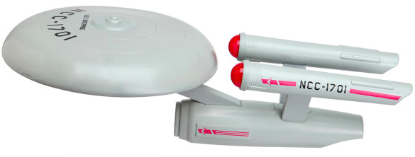
Star Trek Enterprise Frisbee

ThinkGeek got into the prank business yesterday (April 1st) with this flying disc "product".


Star Trek U.S.S. Enterprise Flying Disc

Info: The saucer section (made of space-age plastic) is the part you throw (just like a regular flying disc), but the Star Trek U.S.S. Enterprise Flying Disc also has the rest of the ship attached (made of foam). The saucer section spins freely, and the secondary hull actually stabilizes and flies behind it. The result? A U.S.S. Enterprise you can easily throw and catch. The Star Trek U.S.S. Enterprise Flying Disc - it's the most fun you can have without anti-gravity, a bottle of Saurian brandy, and four Tribbles! ($24.99)

Tuesday, April 01, 2014

Do Over: March 2014

Wayback MachineCatch up on last month's noteworthy posts you may have missed...

  • MLU vs. USAU
  • AUDL Jerseys: Minnesota & New York
  • ABC's of Pro Ultimate Logos
  • Interview: Professional Ultimate League creator 
  • Eradication of Ultimate Problems

    BREAKING: Scientists from the Global Ultimate Problems Eradication Initiative (GUPEI) declare the world to be free of Ultimate problems, becoming our generation's legacy to all future generations playing the incredible sport of Ultimate. At this unique moment, the lead scientist from the GUPEI announced: "All Ultimate problems have been solved, cured and eradicated."