Part of the series critiquing the professional Ultimate team logos and nicknames.
Team: Vancouver Nighthawks
Web: http://vancouvernighthawks.com // twitter: @VCNighthawks
Representation: City // League: MLU
Disc within logo?: No. // Ultimate element in team name?: No.
Background: A nighthawk is not a true hawk since it has no large, strong beak or talons; rather, it's an American bird with long wings. Who can forget the 1981 film "Nighthawks" starring Sylvester Stallone? Not to be confused with Edward Hooper's "Nighthawks" painting. Read MLU's rationale for the team name.
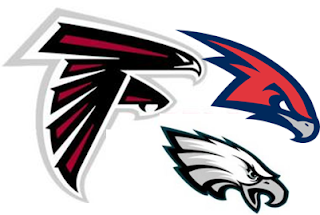
First Impression(s): This nighthawk shares the same hair stylist as Sonic the Hedgehog. A spiked/shard hairstyle isn't for everyone, but is totally punk.
Eli's Eval: The hawk head is a really fun drawing, even if it is reminiscent of other feathered mascots.
The tiny beak and wildly feathered back make it look aggressive and aerodynamic and nasty. Like one of those 5'6" squirrelly handlers who doesn't look like much and then torches your team for an hour straight.
The type is too delicate and does not contrast well with the hawk head. The choice of a serif font puts it in competition with the hyper backside of the hawk head. The weight of the type is fine because with the heavy stroke outlining it, it has enough weight to balance the hawk. I think the hawk head needs to live without the wordmark, because the they are both too detailed and competing with each other visually.
:Eli's Grades:
Grade: B+
On Logo: A
On Typography: B
Thoughts on this MLU's team name & logo?


2 comments:
... did you miss the incorporation of the maple leaf into the design...
Good eye, Mortakai.
I'm aware of the 11-point Canadian flag maple leaf. Tho, I see only 9 points on the left-side of the Vancouver logo.
Post a Comment