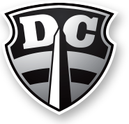
Part of the series critiquing the professional Ultimate team logos and nicknames.
Team: Washington D.C. Current
Web: http://washingtondc.current.mlultimate.com // twitter: @thedccurrent
Representation: City // League: MLU
Disc within logo?: No. // Ultimate element in team name?: No.
Background: The Potomac River forms the current southwestern boundary of Washington, DC. The polluted river - a drinking source for the DC metro area - is consistently named as America's Most Endangered River. The "Current" moniker currently exists in DC as a sushi restaurant & a neighborhood newspaper.
[Also, see MLU's team name rationale.]
First impression(s): Yes, the Raiders of the MLU have arrived. Kinda medieval, and also (very) phallic. Perhaps, a bit of influence from the District's first-established pro Ultimate team, or the Wizards?
Eli's Eval: Another MLU shield logo. The type is strong and clean. The graphics are simple and well-handled. There is nothing extra here but enough to know where the team is coming from. The "D" and "C" are awkwardly rotated and don't seem to be in proper alignment with each other. The font choice for these letters has an inconsistent serif, particularly on the "C" which throws the overall balance out of whack. There does not seem to be any design for the actual team name, "Current", which is a strange omission when building team identity.
Looks good far away but has a lot of little problems up close. The inner gray stroke on the shield continues around only the middle of the Washington Monument, and there it is so much thinner as to not be there at all. The overall effect of the large letters, central vertical slab, and arced strokes makes this logo look like a cartoonish smiley face; sans team name.
:Eli's Grades:
Grade: B
On Logo: B
On Typography: B+
Thoughts on this MLU's team name & logo?


2 comments:
Looks like a face to me. The "D" and the "C" are the eyes, the monument the nose, the black stripe the mouth and the indents of the shield, the ears. He looks kinda spooked. Can you see the face too?
I see the face, Ulti Craig. The bottom gray portion looks like a beard. The mouth looks to be frowning/scowling.
Post a Comment