In November 2013, Boston's
original home jersey for 2014 were different from what you see them wearing today. The jersey color stayed the same, but the smudge white logo that looked like a "W" only when accompanied with context (e.g.
Boston Whitecaps white hat) was later replaced by a B (for Boston) with a smaller "W" embedded into the comb over wave. Boston's light blues have been their j
ersey of choice for the first 3 weeks - 2 home games, 1 away game - of the 2014 MLU season.
 |
| Before & After: Whitecaps home jersey |
We just can't unsee the original jersey design, so here are some
possible explanations for that alternative logo of the Boston Whitecaps.
#1. The "
W" represents the history of Boston's name change;
wiping away
Bootleggers and updating to Whitecaps, kind of like using correction fluid:
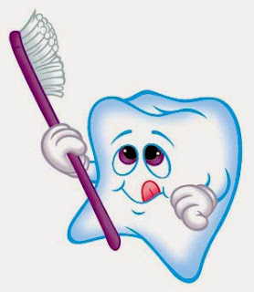
#2. The "W" smear is an abstract molar (tooth) since the team is all smiles after winning the 2013 MLU Championship game:
#3. The "
W" blob is a tribute to Boston's mixed club team,
The Ghosts:


No comments:
Post a Comment